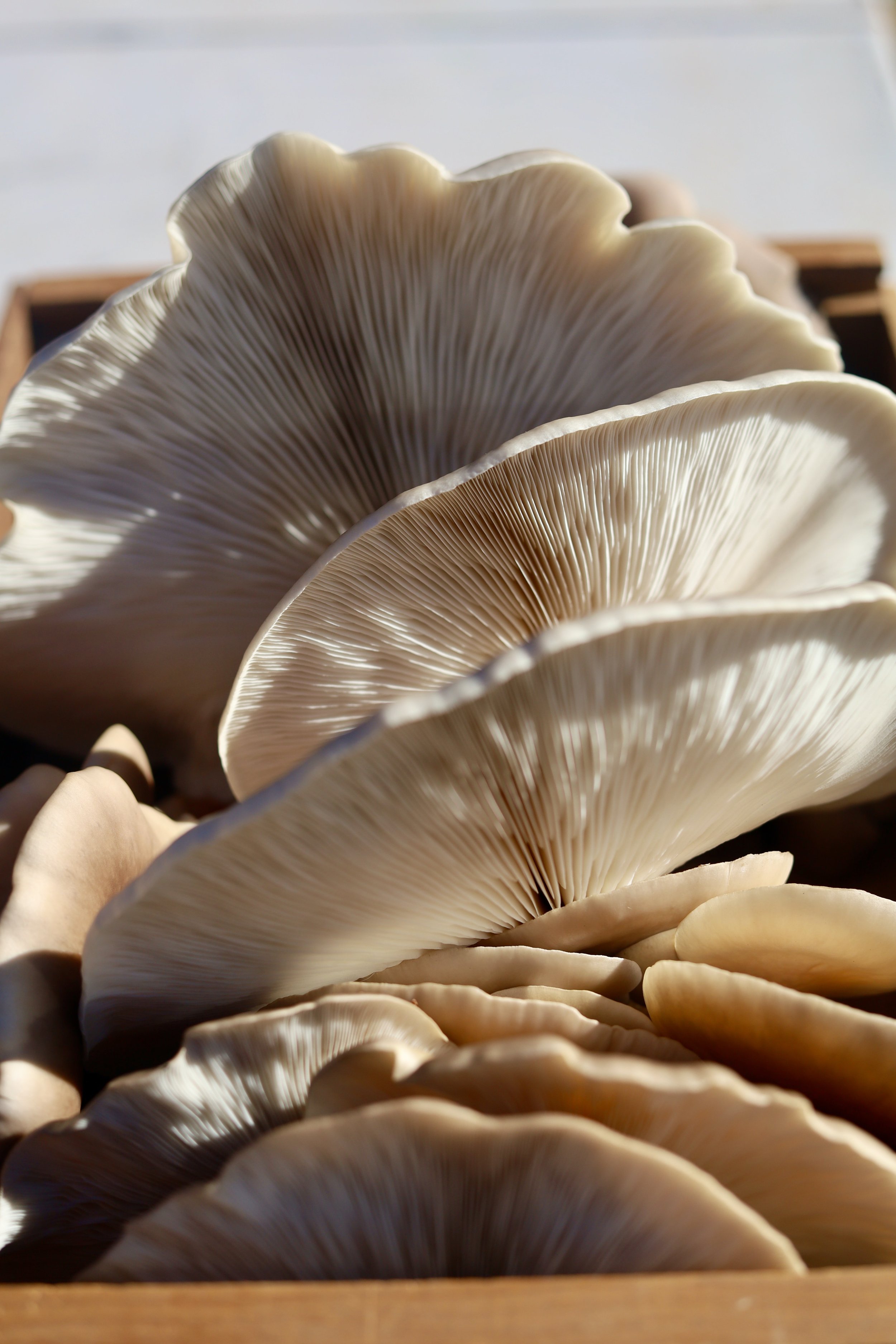
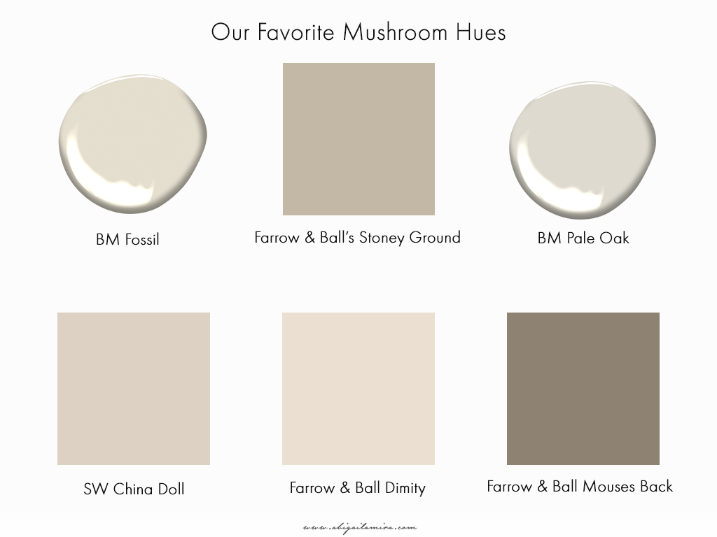
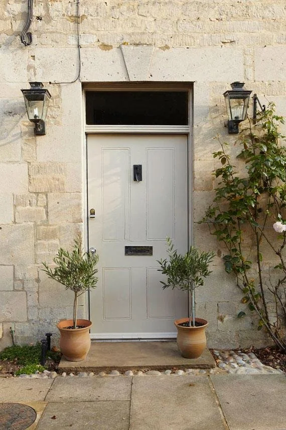
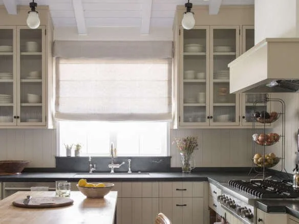
I am often asked a lot of questions about my favorite colors. So today I thought I would round up some of my favorite mushroom hues. I like to use these colors to create sophisticated designs that feel a little warmer than bright whites. They are BEAUTIFUL as an all oVer color, on paneling and cabinetry.
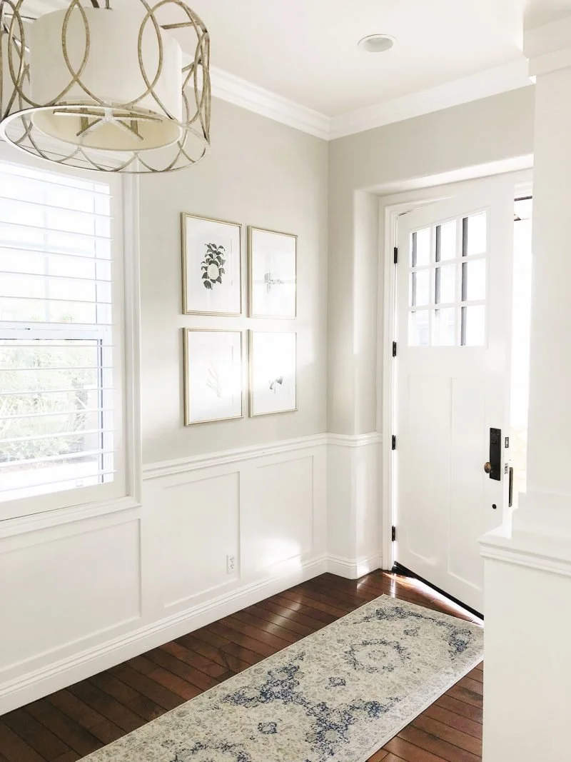
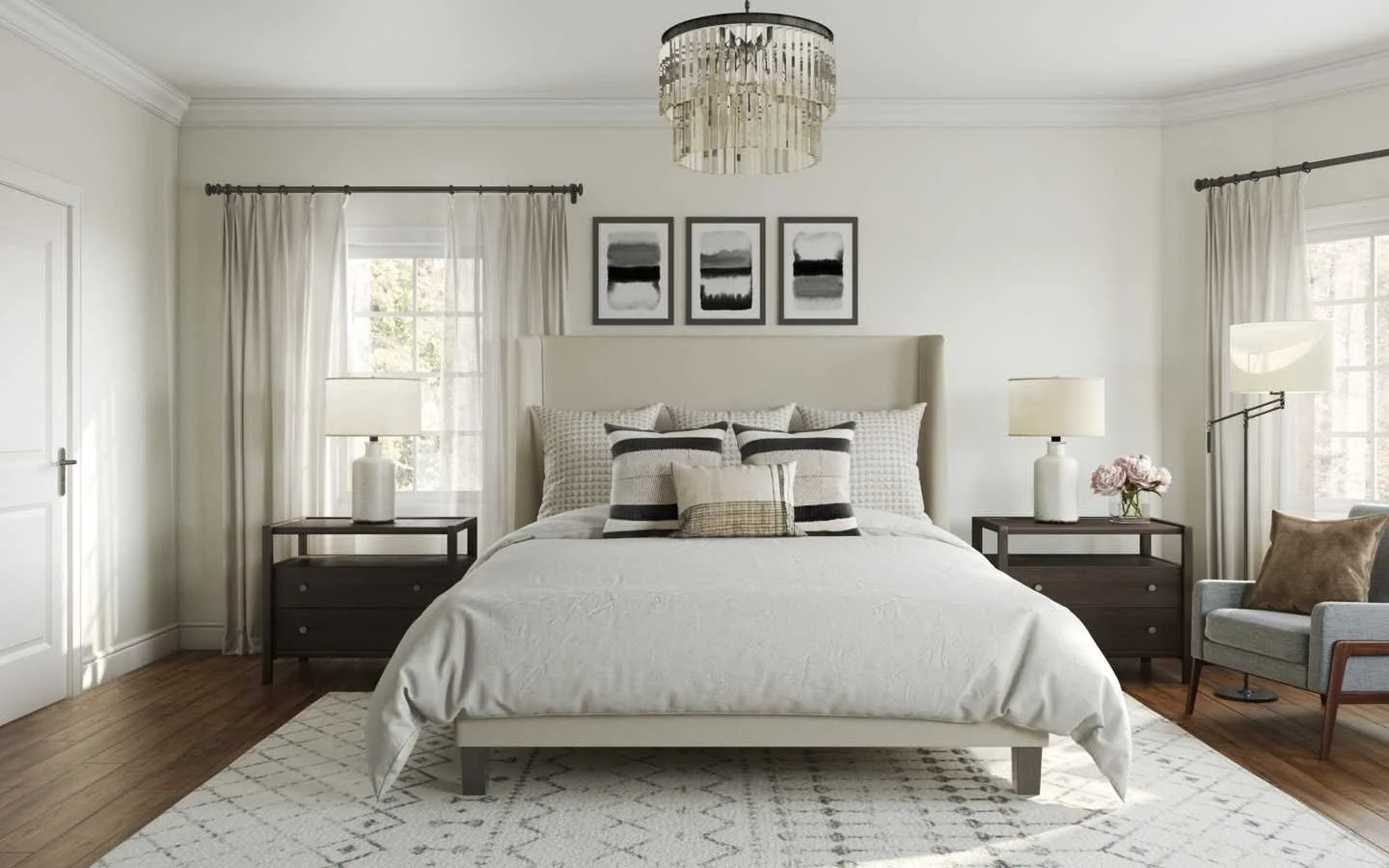
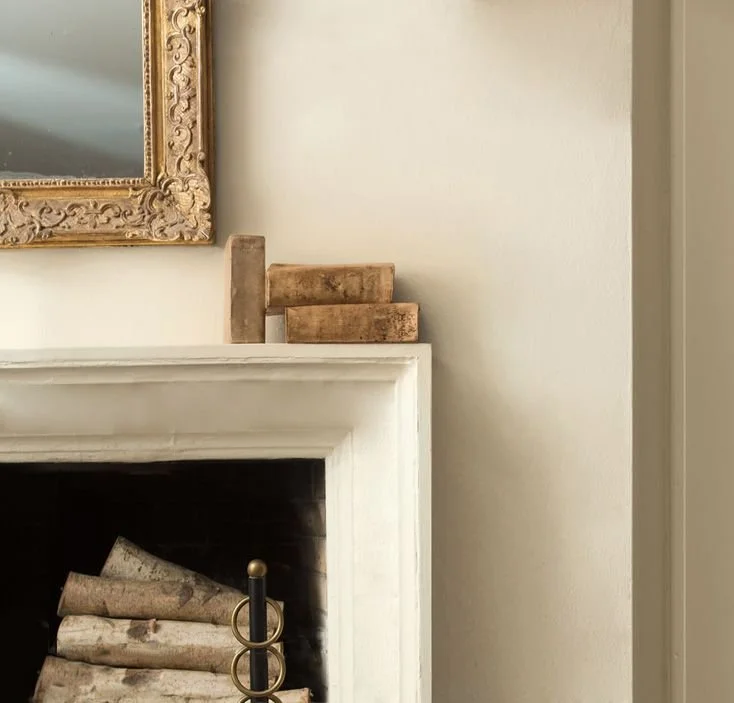
First up is one of my favorite colors, Benjamin Moore's Pale Oak. This color reads like a gorgeous soft greige with warm undertones in natural lighting. It can appear more beige or gray depending on your lighting. This color is so versatile and can be used on walls, cabinets, or even exteriors.
Source: A Thoughtful Place
Source: Havenly
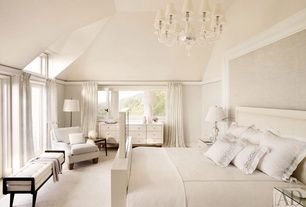
Another pretty color by Benjamin Moore is Fossil. This color is a very light, taupe grey. It has cooler undertones and is great for modern spaces with natural light.
Source: Benjamin Moore
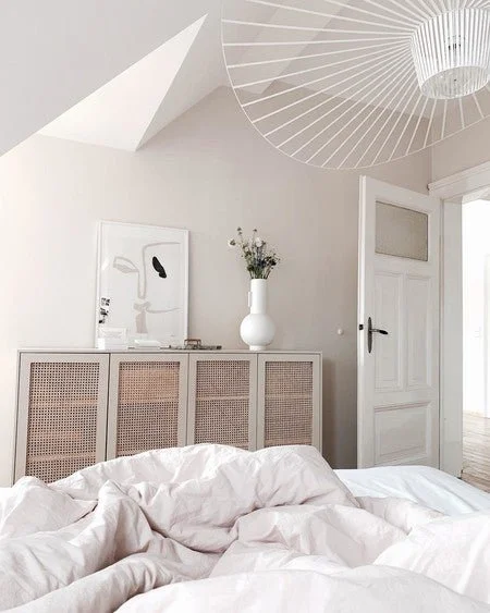
Next up is Sherwin Williams China Doll. This color is light beige with mild undertones and can add warmth to rooms facing the north. It works really well in bedrooms with feminine touches.
Source: Zillow
Then we have Farrow & Ball Dimity. This interesting color is a red-based neutral, creating a subdued taupe that adds warmth and depth. I like this for homes that want more of an aged, collected-over-time feel. “Dimity is named after the lightweight cotton fabric originally used to make ladies’ bustles, but which is now more commonly used for bedding” -Farrow & Ball
Source: BY SHNORDIC
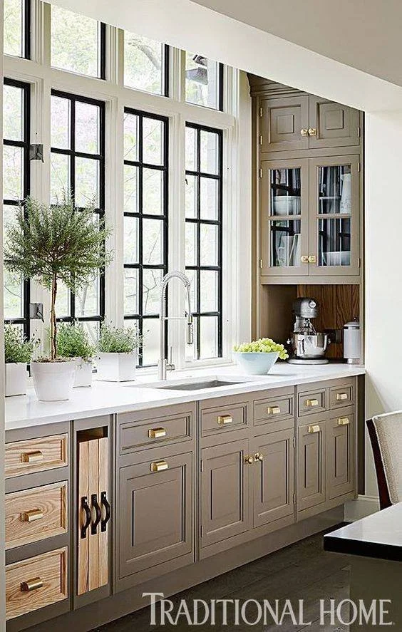
When I think about darker mushroom hues, this color immediately comes to mind. Farrow & Ball’s Mouse’s Back is a wonderful, classic grey-brown and gets its name from British field mice and their fawn color. This color is green-based creating a cozy feel and helps soften even the largest of rooms. I love seeing this on cabinetry as well as walls.
Source: Traditional Home
Last up, we have Farrow & Ball’s Stoney Ground. A neutral that has a classic stone color as the name suggests. With slight red undertones, this color will add warmth and create a soft feel. It pairs beautifully with Mouse’s Back for a quietly cohesive color scheme perfect for exteriors, cabinets, and walls.
Photo Source: Farrow & Ball
Source: Pinterest
