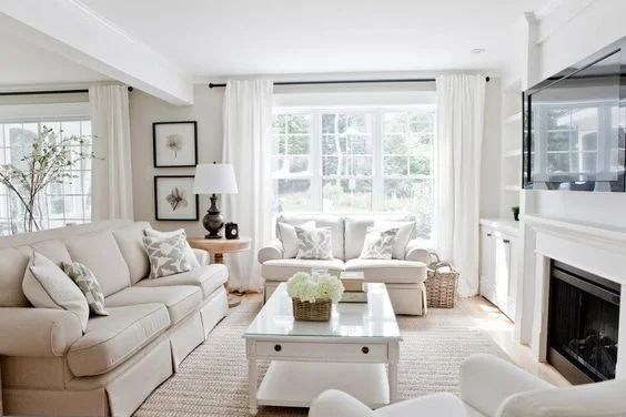
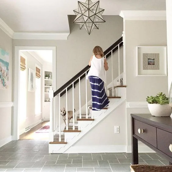
After our very first Ask Abigail Amira blog post, our inbox was flooded with questions. I love it, keep them coming! We are answering more questions from our readers, and this one is from Jessica "I am looking for a neutral color that wont seem boring, what do you suggest?" Finding the right neutrals should be easy, right? Not so much when there are so many different color options. How do you choose the perfect one for your space that isn't boring? Today I will try to help by showing you our favorite creamy neutrals.
Source: homebunch.com
1. SW Accessible Beige
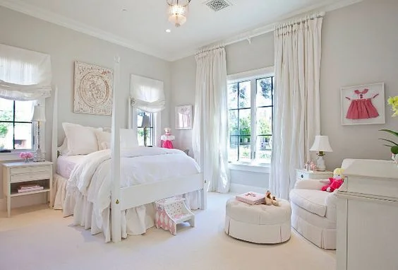
This showstopping color keeps your room looking so light and airy. I love that it looks like the perfect light gray in some lighting and in other lighting a beautiful light beige. I actually have this color in my kitchen and dining room. I have lots of natural light during the day (East facing and West facing windows, lucky me!) so I get to experience both beautiful colors, depending on what time of day it is. I love this color so much, I will be using it in my new shop (more details on that soon!).
Source: vintagewhitesblog.com
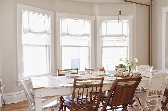
2. Farrow and Ball Skimming Stone
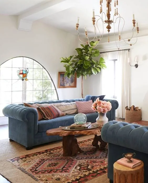
This is a warm color with light grey undertones. It is such a beautiful and versatile color. I love it for a soothing bedroom, a warm contemporary space or even a cozy dining room like the image shown above. I love that the mixture of wood tones and whites go perfectly with the neutral backdrop.
Source: Beth Webb
3. BM China White
This delicate off-white is soft and subtle and with a LRV of 76, you know your room is going to feel light and bright. For those of you that don't know what LRV is, it stands for Light Reflectance Value and basically measures the percentage of light that is reflected from a surface. LRVs range from 0-100 with 100 being pure white and 0 being absolute black. This bathroom is stunning and a great representation of how this color can be used.
Source: Elizabeth Roberts Architecture & Design
4. BM Chantilly Lace
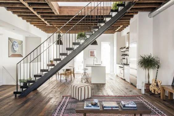
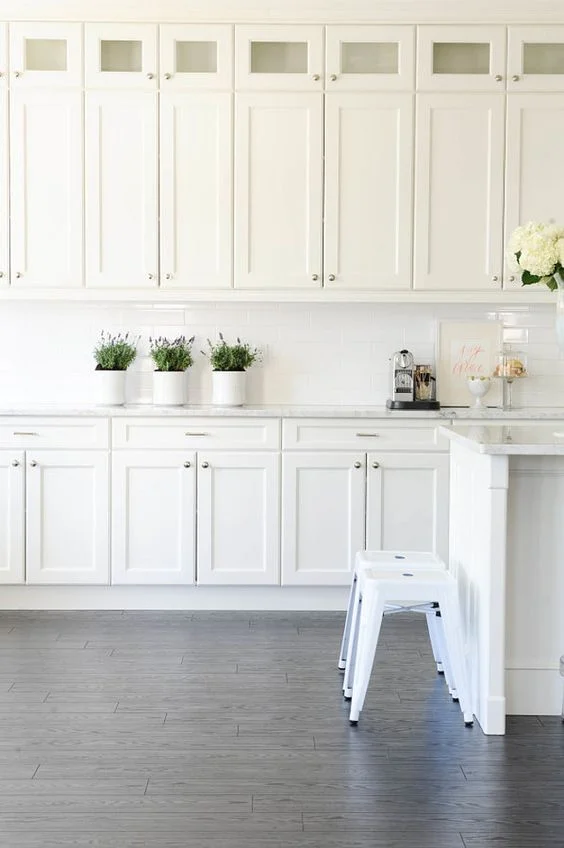
This is a very clean, bright white compared to most other whites. It's a cooler color and I believe you can't really go wrong with it. I love this color on cabinets, trim, and as an all-over color like in this super cool townhouse.
Source: kylie m interiors
5. BM Classic Gray
This is a super pale gray that doesn't seem as cold as other grays thanks to its tan base. Like the name says, this is a great classic that can be used anywhere. If you're unsure of the right gray for your space, I would highly recommend this color!
Source: localedesignbuild.com
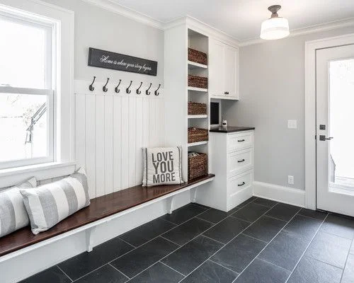
6. BM Moonshine
This is another wonderful gray that I often recommend. I feel like its a little light and cooler than Repose Gray but it still feels warm. I love it contrasting with the dark wood and tile flooring in the image above.
Source: Nicole Lee Interior Designs
7. BM Paper White
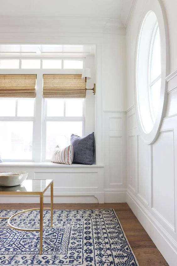
I love this off-white in bedrooms! It looks very sophisticated and almost like a light gray. If your goal is to create a tranquil, serene bedroom, then you may want to try this color out.
Source: Monika Hibbs
Source: Studio McGee
Source: stylebyemilyhenderson.com
Source: Tim Barber LTD Architecture & Interior Design
9. BM Swiss Coffee
This is such a calming color. It has a creamy gray undertone and feels warm thanks to the hints of both yellow and green. It looks great on walls, trim, ceilings and exteriors. The exterior shown used Swiss Coffee as the main paint color in a flat finish and then on the trim in a semi-gloss finish for a beautiful effect. For a slightly deeper color try BM French Canvas which leans more towards the khaki family.
Source: Lux Decor
Source: younghouselove.com
10. BM Edgecomb Gray
Finally we have the crowd favorite, Edgecomb Gray. This gray feels warm and welcoming while adding that timeless feel, especially when paired with black accents. It's another one of those colors that varies so much depending on the lighting. I like to use it as an all-over color for that reason. It looks amazing on exteriors as well.
Check out our favorite saturated blues and greens too!

